ABOUT US
red hat
Red Hat came to MediaNerd with a single goal: To break down Red Hat’s complex business model and USP’s into an easy to understand and sellable message.
visual development
Our visual development was focused around some key areas: How could we show complex, bespoke business solutions from Red Hat in a clear and concise way? and how can we make use of visual monikers to help viewers identify the concepts we are showing?
Another visual moniker that we knew that we had to show was the ever-changing business landscape that Red Hat is helping business partners navigate through. The detail and styling that came from the always shifting blocky surface formed a strong foundation for our storytelling.
Our visual development paired with a renewed focus on Red Hat’s existing brand identity allowed us to fuse their easily identifiable visual assets with a new and exciting 3D style that can be seen in the final video.
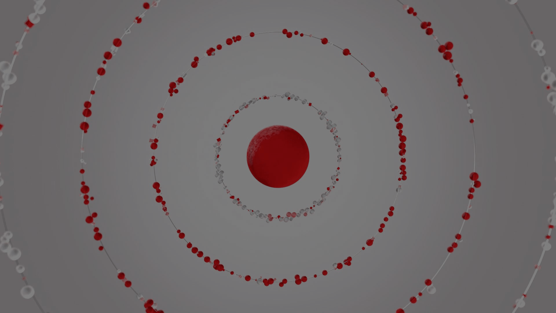
It was clear from the beginning that strong use of colour would help viewers be able to differentiate between the different identities in the animation. Any introduction of Red Hat would make use of their powerful red, while the Partner (or in other words, the viewer) would be a light and peaceful blue. As styling developed our team moved towards a light and friendly overall tone - in the final video the Partner is represented as a clear colour. As the clear partner is injected with a burst of red, we are representing the way in which Red Hat is guiding a partner through their business environment.


